Olympic Virtual Stadium
Designing a digital stadium experience to enhance fan engagement and national pride
WHAT I DID
Cued recall, user interviews, cognitive walkthrough, archetype mapping, journey mapping, user stories, HMW Statements, competitive analysis, sketches, wireframing, design systems
DURATION
12 Weeks
TYPE
Solo project
The spark behind the idea
The pandemic reshaped sports fandom: empty stadiums, declining attendance, and a shift to virtual engagement.
With a 1,950% rise in live-streamed matches and the Olympics losing its audience, fans craved reconnecting and feeling the energy of live sports again.
Defining the goal for the project
Empower virtual support
Create ways for fans to stay connected with their teams, even from a distance.
Enhance online engagement
Foster deeper interactions among fans, making digital experiences more immersive and communal.
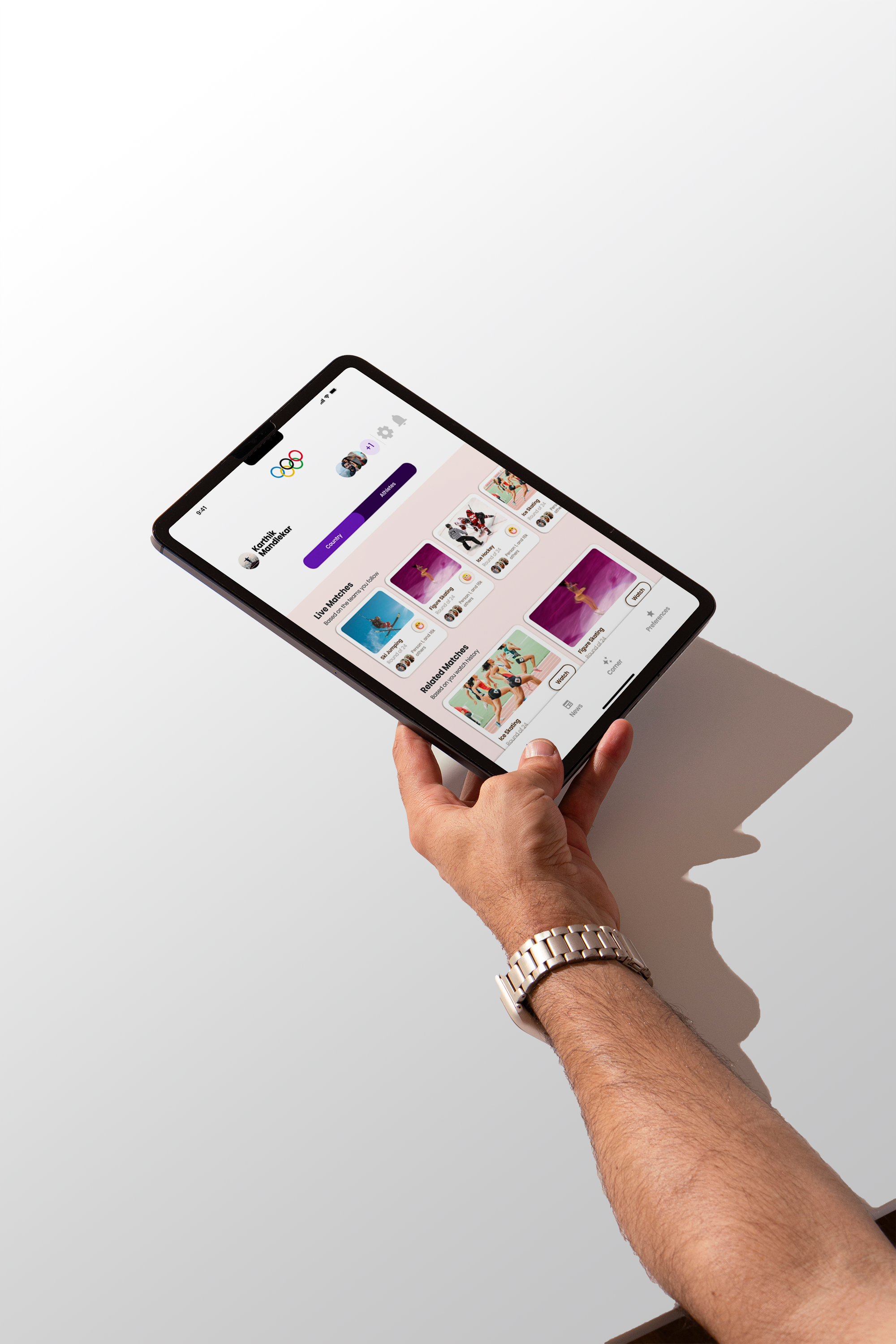
The solution: bringing the stadium to you
An immersive application that allows users to virtually experience the atmosphere of a stadium engagement
Cued recall & interviews
I conducted cued recall sessions where participants described their entire stadium experience, from arriving at the venue to leaving after the match.
Alongside this, one-on-one interviews helped uncover their motivations, emotions, and behaviors.
Fan experiences from arrival to exit to identify key emotions and behaviors
Interviewed fans to uncover motivations, needs, and engagement patterns
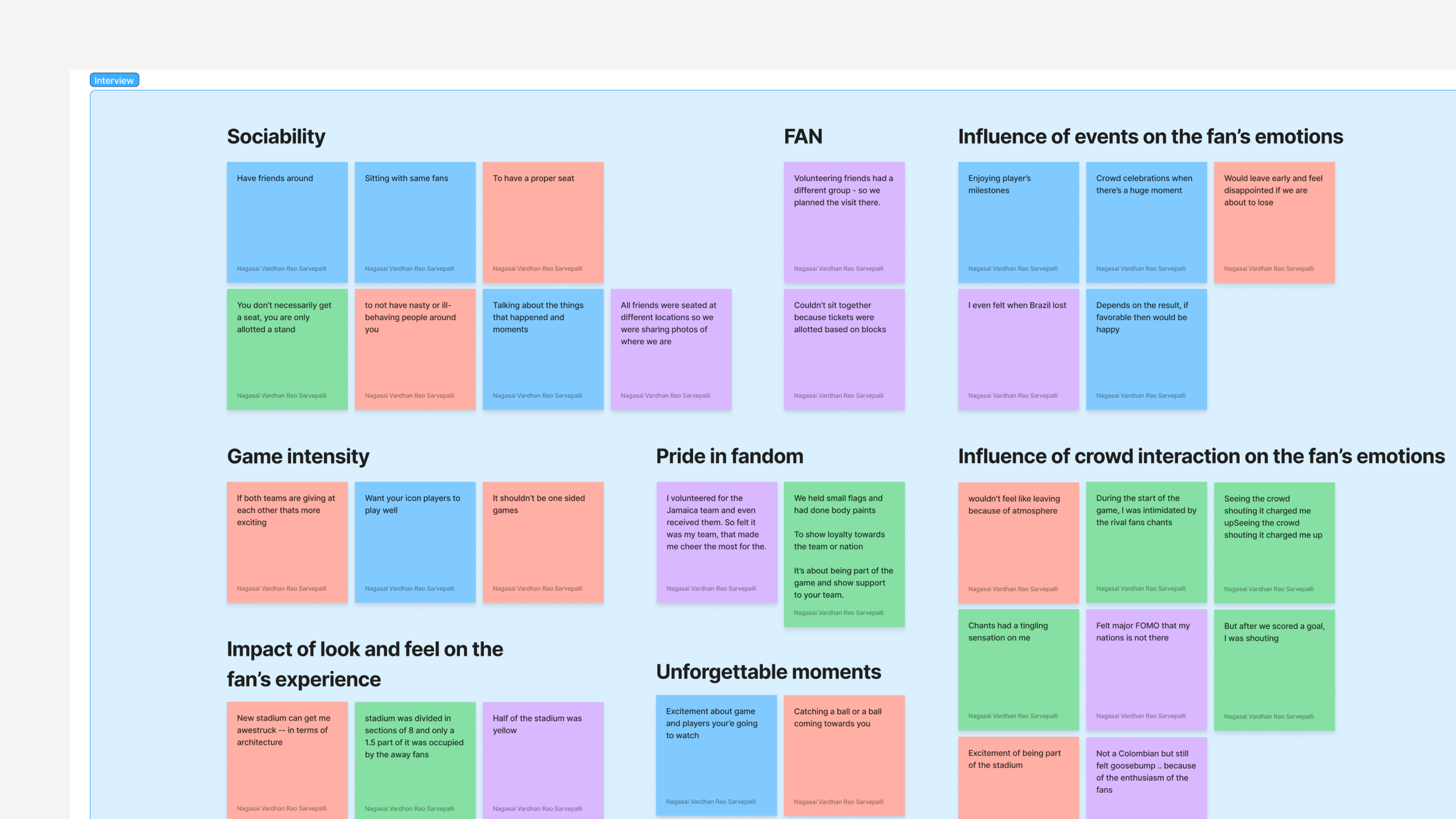
Affinity mapping: understanding fan experiences
I synthesized insights from cued recall and interviews into affinity maps, grouping recurring themes in fan behavior, emotions, and expectations.
Grouped key insights from research to identify patterns
Defining archetypes
From affinity mapping, I identified three distinct fan archetypes based on behavioral patterns, goals, and needs. These archetypes—Social Butterfly, Thrill Seeker, and Crowd Seeker—helped define user motivations and engagement styles
THRILL SEEKER
-
Connections and belonging from social interactions. Wanting to have memorable experiences.
-
To express themselves and express themselves. Needs environment to be visually appealing and stimulating.
SOCIAL BUTTERFLY
-
Wants to seek out new experiences. Seeks a rush of adrenaline.
-
They need to be constantly engaged. A freedom to explore without restrictions.
CROWD SURFER
-
To feel like belonging to a group. To share in collective experiences.
-
To connect with others. To feel a sense of closeness with the people around them.
Brainstorming through
how might we statements
From affinity mapping, I crafted user stories that informed “How Might We” statements, shaping the direction of my brainstorming and design exploration.
FEATURE 1
Location-based stadium with allotted seating
Insight from research
Fans value proper seating, being near friends, and an immersive stadium atmosphere. When seated apart, they share photos to stay connected. This feature emulates the stadium experience, enhancing social interaction.
FEATURE 2
An adaptive UI based on the nation you support
Insight from research
Fans feel a deep connection to their team through colors, flags, and visual identity. The impact of personal expressions like body paint and flags inspired this adaptive UI—allowing the interface to subtly reflect the nation they support, enhancing pride and immersion.
FEATURE 3
Express & engage with other fans
Insight from research
Fans thrive on collective energy—chants, crowd reactions, and shared rituals enhance the stadium experience. This feature lets users interact in real-time, wave flags, join coordinated cheers, and play virtual instruments—bringing the electrifying stadium atmosphere to the digital space.
FEATURE 4
Expandable screen for a better viewing experience
Design systems foundation
Atoms
Elements that ensure consistency and style for a seamless user experience
Molecules
These UI components systematically combine atoms, creating cohesive and functional structures
Organisms
Pre-built interface blocks composed of molecules provide ready-to-use components for a consistent design
Atoms
BASELINE GRID
Baseline grid
Grid in use
COLOR TOKENS
Centralized color management for consistent and easily maintainable color schemes on the website.
Primary colors
The application's focus leans toward having fun and having a passionate experience. Purple and pink make up the dominant color scheme, which also heavily relies on neutrals to achieve balance.
Secondary colors
In order to represent all country flags, these colors are expected to be used. These colors are typically used over a neutral hue to balance their dominating tendency. Decisions about the layout won't be made based on these colors.
TYPOGRAPHY
Poppins typeface was chosen for its clean and modern design, enhancing readability and providing a visually appealing user experience on the website.
SHADOWS
This helps how shadows help differentiate interface levels, adding depth and clarity to enhance the user’s perception of their importance.
The graph illustrates the shadow elevation levels associated with each component in the interface, indicating their relative importance.
Molecules
BUTTONS
Types and Sizes
These buttons with versatile leading and trailing icons can accommodate various devices and components.
States
To improve usability I’ve incorporated hover, active, and disabled states into the button system.
MENU TABS
Organisms
NAVIGATION
Desktop: This header is used across the whole application.
Mobile: These variations of the top and bottom menus are used across the whole application.
CARDS
Content cards: They present information in a visually appealing manner
Carousel: Showcases information dynamically and interactively.
Check my other projects as well! 🔭
GOLAZO – IOS APP ↗
Helping fans stay updated, engage in meaningful football conversations and strengthen Connections
LATICRETE ↗
Testing & refining a new website design to engage younger audience before launch
COSMOS CLUB ↗
Improving usability & accessibility for a prestigious social club


